matthew sandahl

UI/UX Designer

case study

WSI Solutions

One of the largest privately held 3PL companies in the U.S, WSI provides many warehousing and distribution services as well as the digital platforms those solutions run on.

information overload

The old site was basic, antiquated and just a lot of everything at once. The site lacked visual hierarchy or direction and that showed in the number of leads they'd acquired. They asked our team of four to make the new site clean, modern, purpose-driven, intuitive and informative.

don't make me think

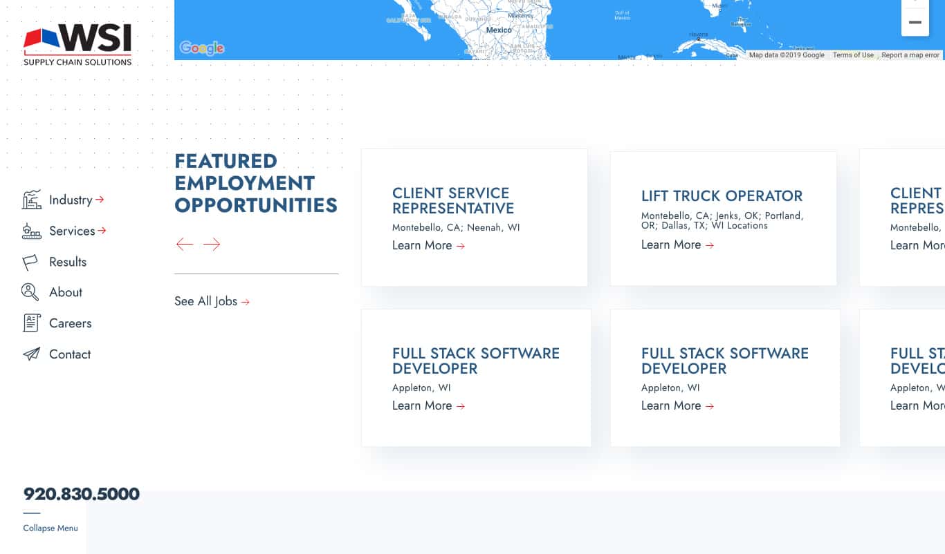
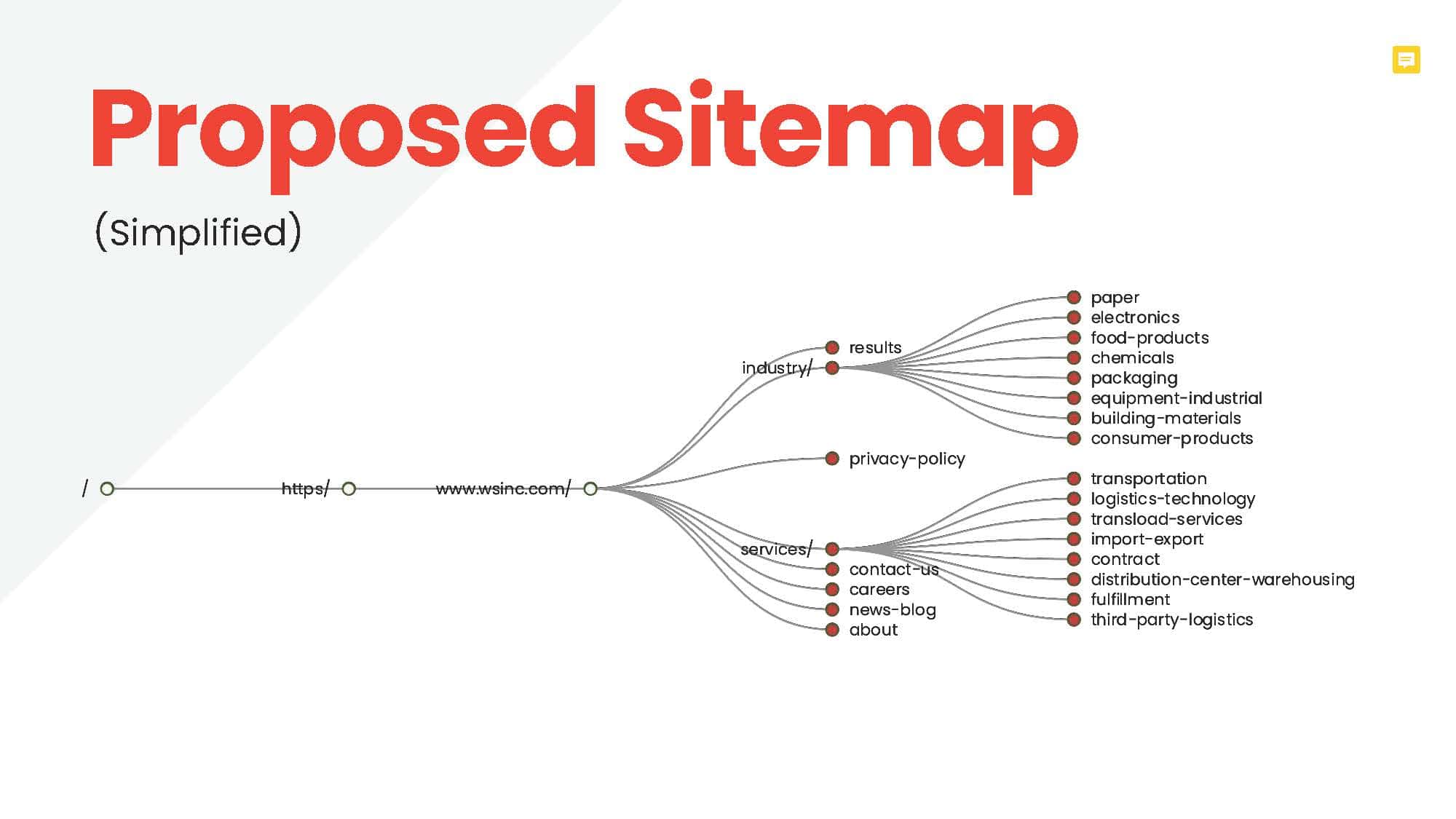
Without a clear and consistent direction, it's easy for a site to evolve into an ever sprawling mass of varied messages and prerogatives. The site had to be distilled into it's essential pages so that users had a clear path forward. User studies show it's easier to scroll than click, so I consolidated similar pages, and I renamed nav links to be shorter and clearer.

moodboard options

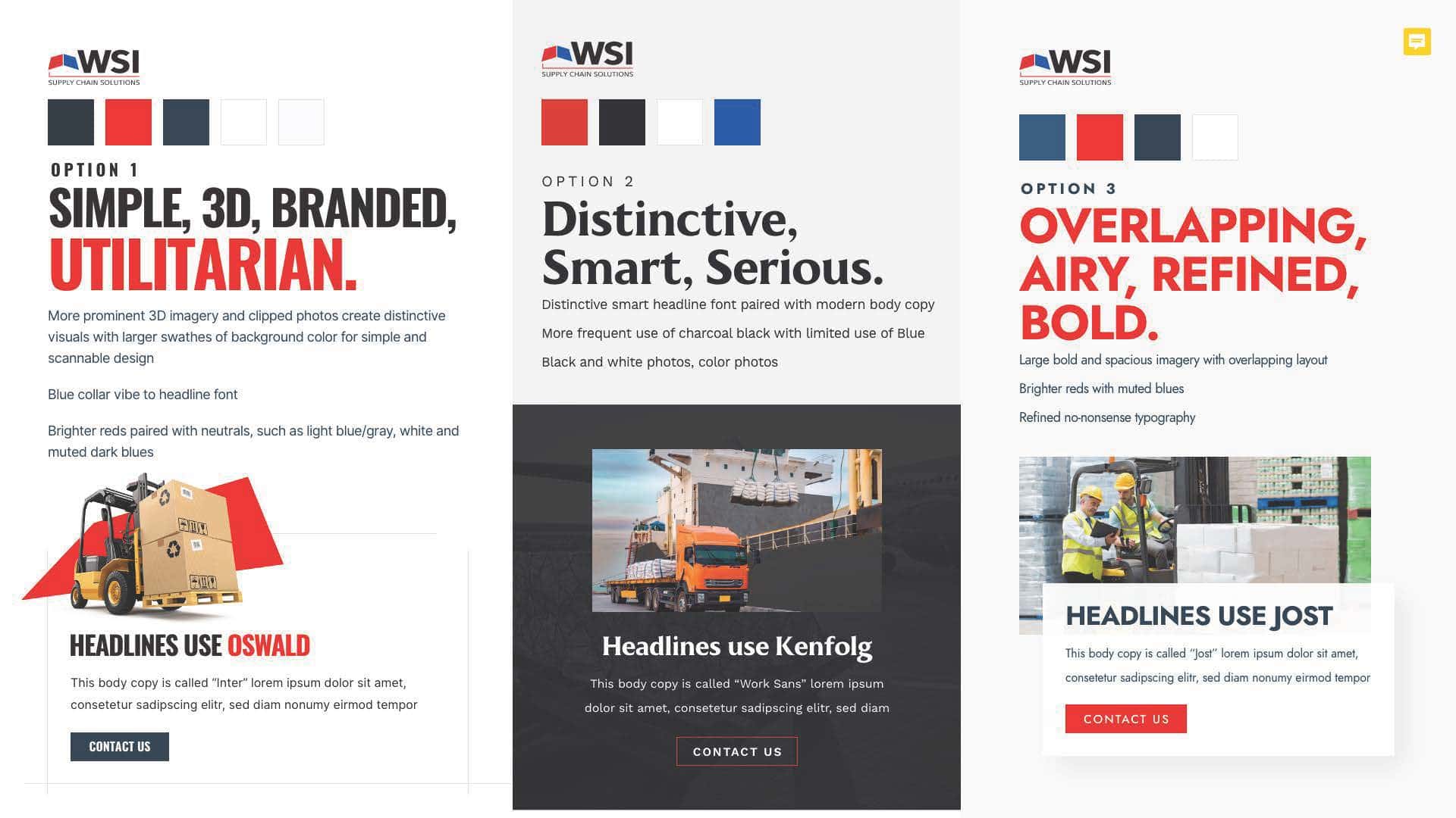
I anticipated this client being more hands on so I shuffled my usual process in order to front load the design discovery phase. I reviewed their brand guidelines and made three alternate moodboards in order to get early client investment and build excitement.

wireframing

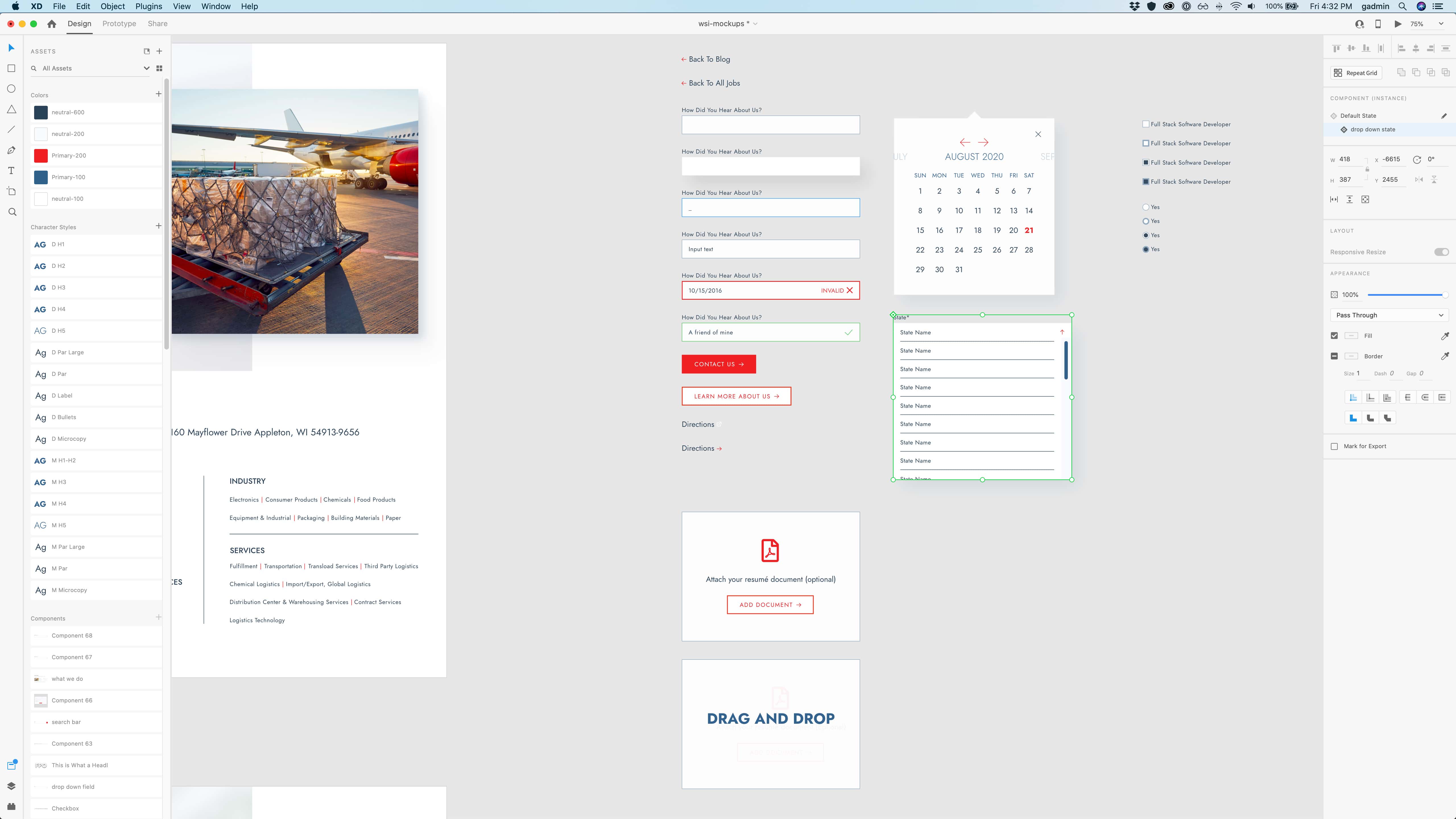
I performed a content audit and compared that information to both their own audience engagement and how competitors were positioning themselves. One of the difficult parts was interpreting the data. Some modules received little engagement but that wasn't necessarily grounds for deprecating their exposure. After sketching out concepts and ideas for myself, I created and pitched a higher fidelity prototype to the client.

aspirational yet true to self

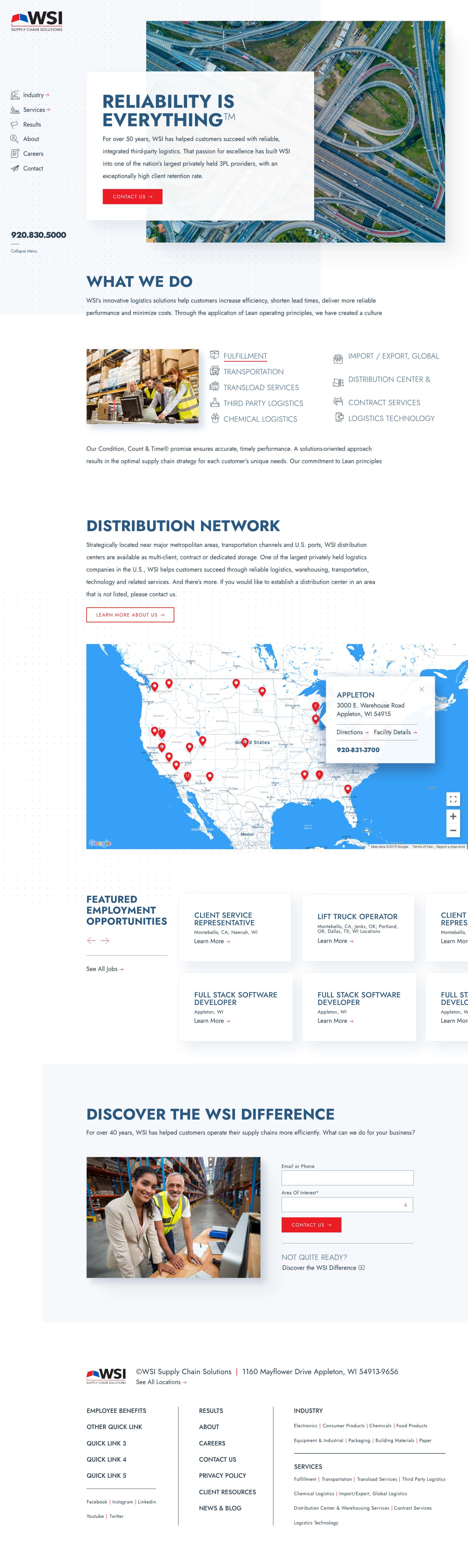
I really appreciated the client's attention to honest yet quality photography. They didn't have  budget allocated to shoot their own team but as a placeholder asked me to choose imagery that depicted people and settings that were both aspirational yet true to self. I sourced those images and created prototype designs which brought together all my previous research, brainstorming and discussion.

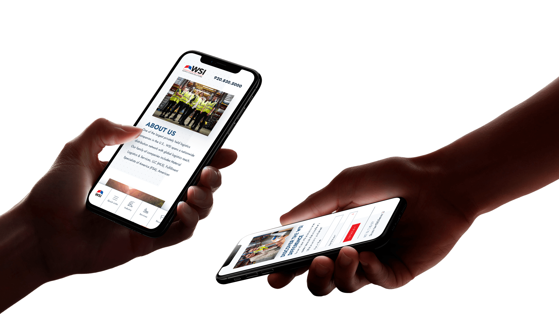
test navigation concepts

The client had a particular well founded interest in both the desktop and mobile navigation. They asked me to explore a few ideas as well as one of their own. I used Adobe XD and After Effects to illustrate four different options. The client ultimately deferred to my proposed choice and asked that we A/B test it against their preference.

what do you want me to do?

We had a lot of talking points throughout the site but I didn't want to lose focus on our main call to action – the contact us webform. In addition to the contact page being listed in the navigation I included a module at the bottom of each page with limited required fields or friction. I also included a link to a company overview video for those who weren't quite ready to make that leap.

hash it out

During the design phase I kept the project manager abreast of my progress and helped with scoping the timeline including internal and client reviews. The WSI team would regularly come to meet us at our North Loop office and I would personally lead the presentations. I often led with giving context for how we'd arrived at this point and then articulating my rationale for the choices I'd made.  Part of the challenge is gauging what client feedback are directives, which are thoughts spoken aloud and which are well considered. But I always aim to give my professional opinion while also listening to the client's feedback. Ultimately it's their site and I want them to be happy and invested in it.

reduce, reuse, recycle

A large consideration of any site is designing it in a way that stands the test of time. Modules and elements can be reused for brand consistency as well as code integrity. I created a UI pattern library to support this effort and serve as a source of truth for future marketing campaigns.

technical considerations

Strategy, design and development are intertwined. To the client, my process follows a Waterfall model, however in my personal notes I outline how these three play together. The Career page needed to have a Spanish translation so in the early stages of design I chose a Variable typeface which had recent browser support and which included a large array of glyphs and cut down on http requests and file sizes.

leading the pack

The launch was met with much appreciation and pride. The Paid Media team continued to help with driving relevant traffic to the site and we A/B tested the mobile navigation so we might make data informed decisions. Do you need help with your brand, strategy, design or SEO? Send me a message to see how I can help.

see more work

let's talk