a social responsibility
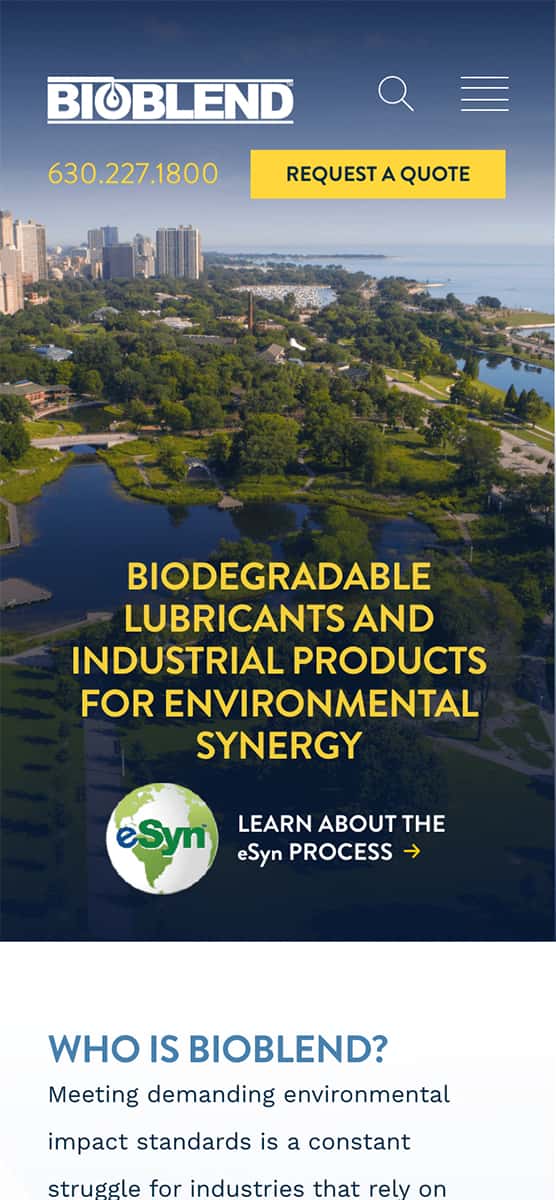
Bioblend's commitment to producing more ecological friendly products is a differentiator for them in their market. In order to convey this forward thinking ambition I implemented a number of recent design trends which I'd observed used effectively during my research. Generous spacing, grotesk fonts and a transparent navigation background helped convey the feeling that this environmentally considerate demographic might respond well to.
bringing users along
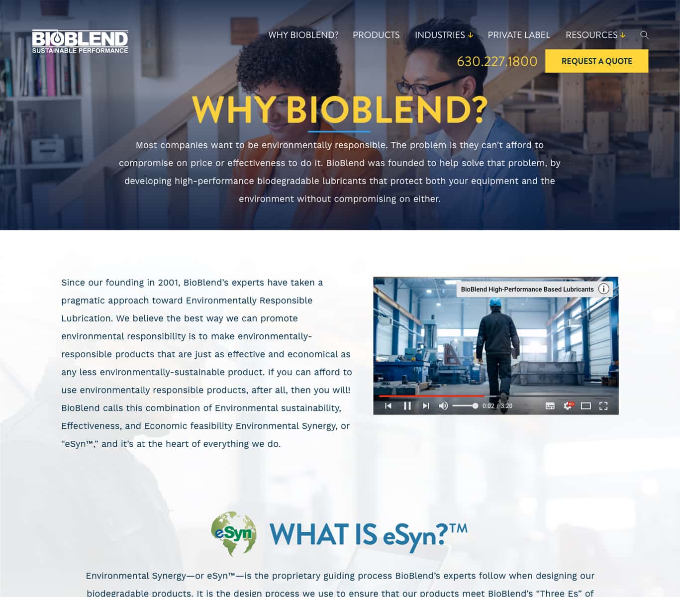
This is a B2B business model and our team recognized the process of leading users to a conversion would be a long game. So I knew a large part of the website would need to build trust while also lowering any inhibitions they might have reaching out to the sales team for more information and ultimately a free quote. This was in part accomplished through well crafted and strategically placed copywriting, which was influenced by current user flow analytics.

establishing trust
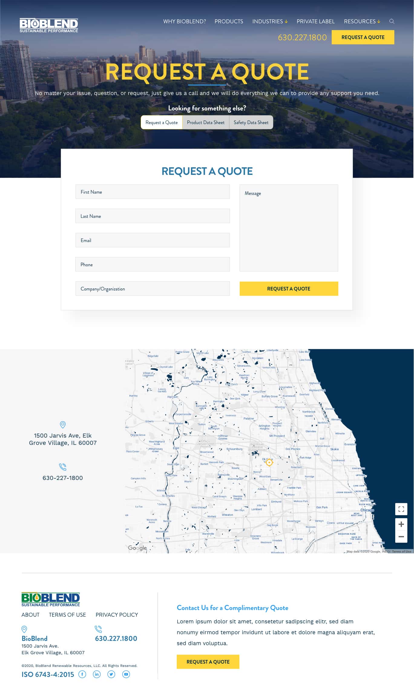
I imagined users would want a solid understanding of the company considering that the lubricants they used could be a hazard to their equipment's performance. On the About page I made sure it was immediately clear this was a US based location. I designed the interactive google map with brand colors and exported as JSON code so it could be used with our Wordpress mapping plugin.
funneling users efficiently
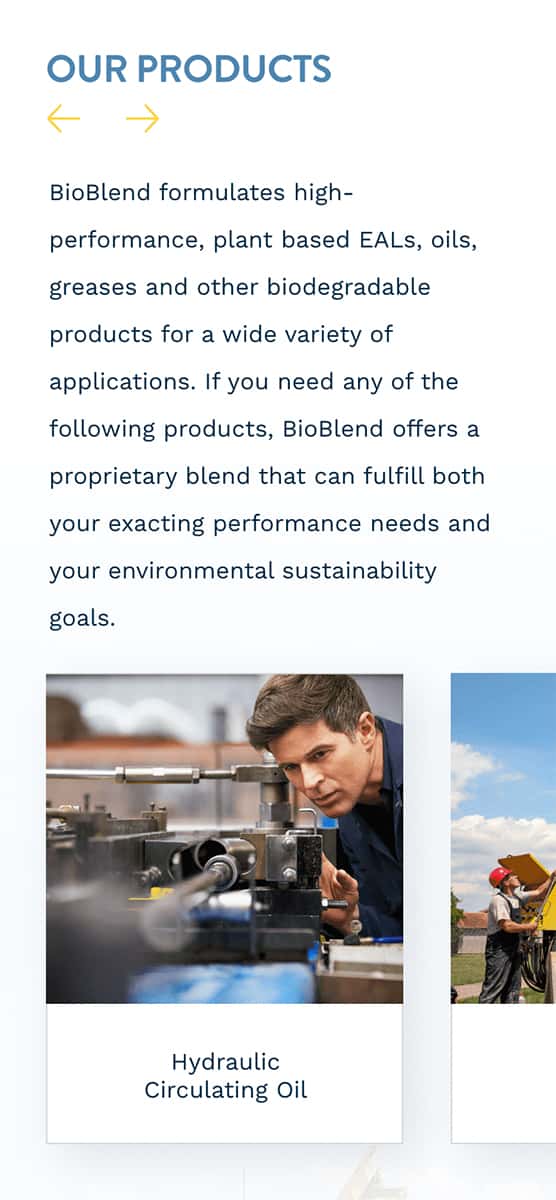
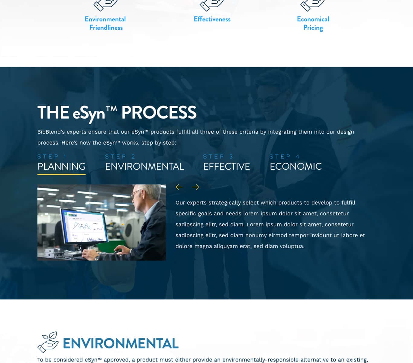
In order to find a specific product the old site required users to visit a specific industry page and scroll through a long list of product names, many of which were complicated acronyms. The assumption was users know what they are looking for and wouldn't be confused or overwhelmed by such a long list. To help less informed visitors through this process I redesigned the product page so users could select a number of interests and features and narrow down the results.

jobs to be done
Some users do in fact know what they are looking for, and only need a clear path to it. Google analytics indicated that a majority of users were visiting specific safety data PDFs for technical details. Those documents on the existing site had a high SEO crawl depth and were often hidden behind tabs, in the name of "simplicity". I made these heavily trafficked assets more prominent by featuring them above the desktop fold and by breaking the established layout grid I'd formed.
the design aesthetic
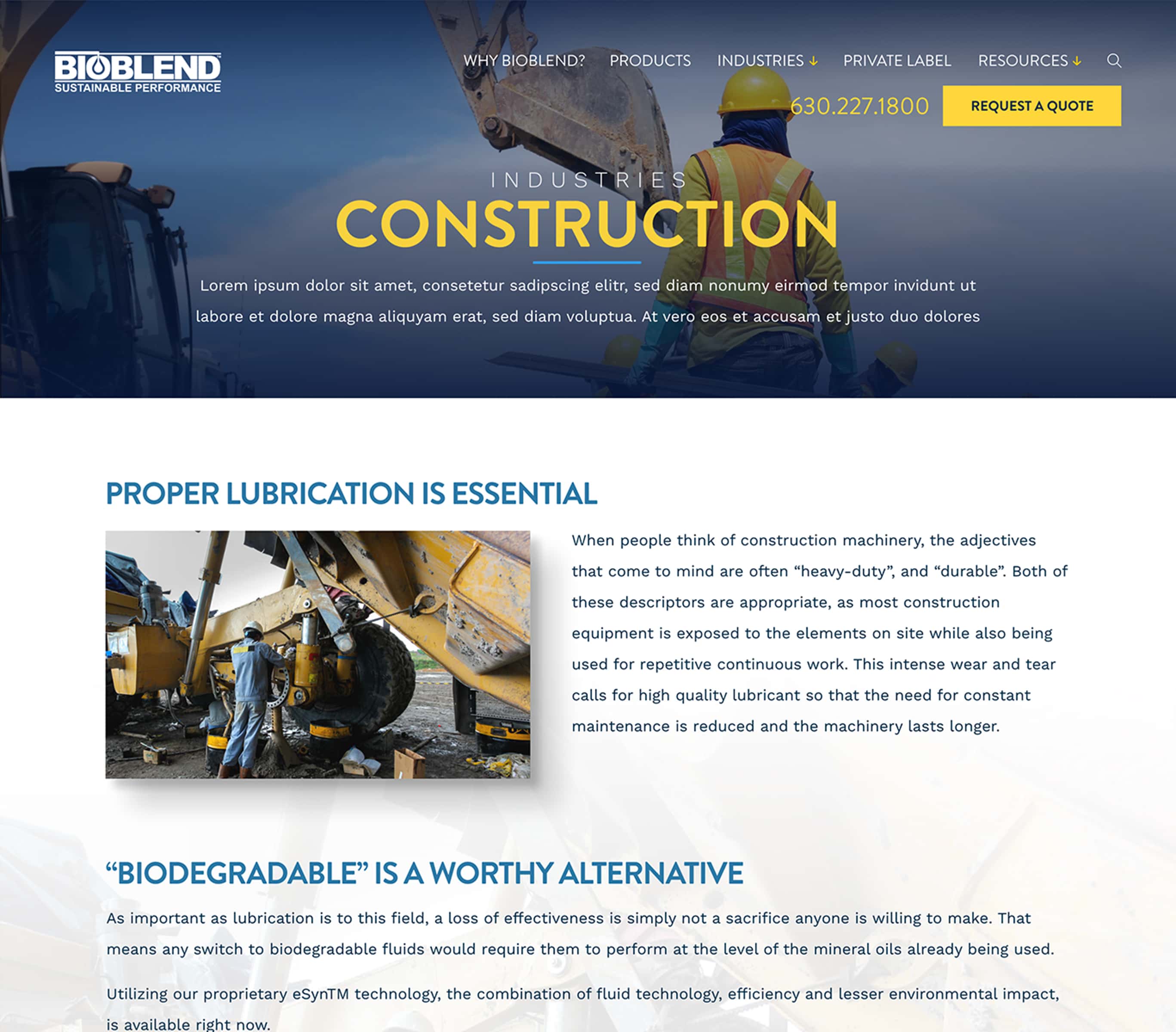
The design of the old site was a bit too playful and obtuse considering the sizable investment we hoped customers would make. This unsuitable treatment was largely due to quirky rounded corners, bright colors and generic imagery. I reviewed the brand style guide and proposed we bring down the saturation and brightness on the blues, tweak the hue on yellow and eliminate the green for the user interface. I also sourced stock imagery which featured people working on machines, which was a sort of subconscious social proof.

a personal challenge
The client asked if we could animate the logo for their proprietary technology certificate. Instead of making an animated GIF or video, both of which have their technical drawbacks, I decided to edit some pre-rendered video footage within Adobe After Effects and export it as a small JSON file. This "Lottie" method was lighter, smoother and had recently gained good browser.
elevating the brand through motion design
User testing has shown that people are very attentive to motion and psychologically rewarded for tastefully done UI micro-interactions. To test this research I took an otherwise simple Team page and added some hover effects and reveals to see if we could get greater user engagement. As of this writing this posit has not yet been confirmed.