matthew sandahl

UI/UX Designer

case study

EAT! Frozen Entrées

Bellisio Foods is a Minneapolis based producer and distributor of several lines of consumer packaged goods. They asked our team to help with their EAT! line and create a new brand and website based on their product packaging. I designed a new responsive website for them that considered the user experience and identified millennial target market.

discovery and competitive analysis

I began the discover phase of the process with a competitive analysis to better understand the CPG landscape and how the brand positioning might fit within that sector. Our digital strategist compiled a project Kick-off document listing competitors and their sites from which I took notes to evaluate their promise and shortcomings. I then made a bulleted list of words and attributes to detail what the site should include or dismiss, conceptually, aesthetically and technically. No design should be created in a vaccuum so I regularly visit Pinterest, NN/g and Codepen for inspiration and best practices. 

sitemap & wireframing

After assessing various design resources, I considered what layout and flow most appropriate for this target market. The client had no existing website or content direction beyond the product packaging so I created a sitemap which followed the desired user flow. Sketching rough wireframes of unique page types helped me to organize my thoughts and visualize how the content married up with design. I then shared these designs with our copywriter so he could begin writing to the format I'd established. After presenting to the internal team I implemented the discussed changes.

high fidelity wireframing

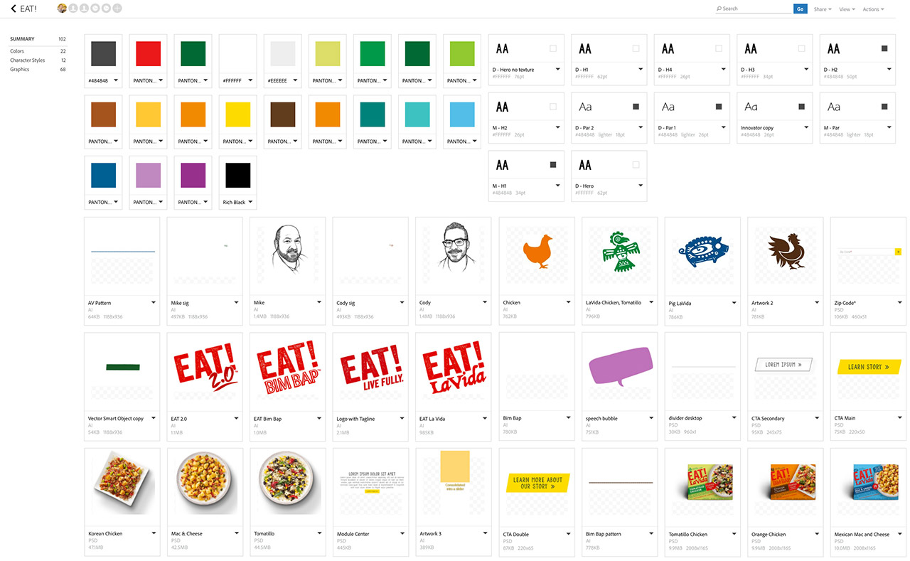
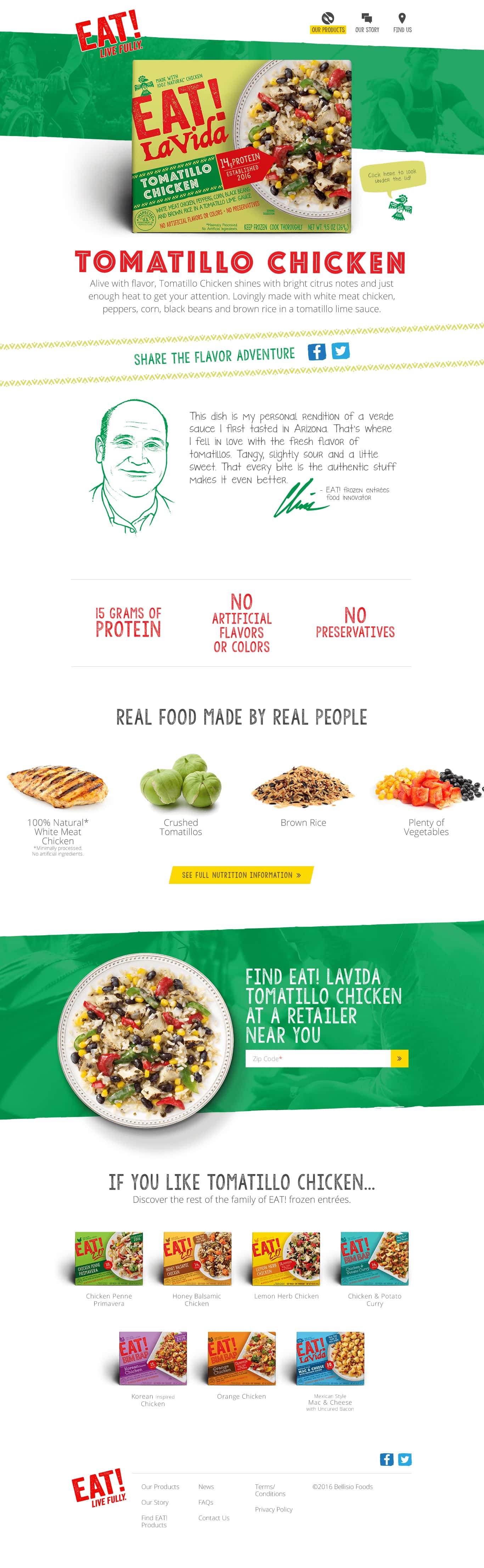
I then recreated my rough sketch concepts into higher fidelity wireframes for client review. The graphics I made were intentionally minimalistic and the copy I placed was descriptive placeholder in order to focus the team less on design and more on content and flow. By organizing pages into a sitemap the client was able to gain a higher level holistic view. These wireframes ultimately helped ensure internal and client buy-in, and mitigated any unnecessary changes which might normally occur later during design or build, when changes are more costly.

UI design

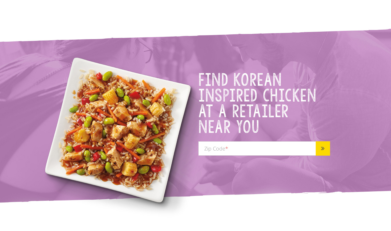
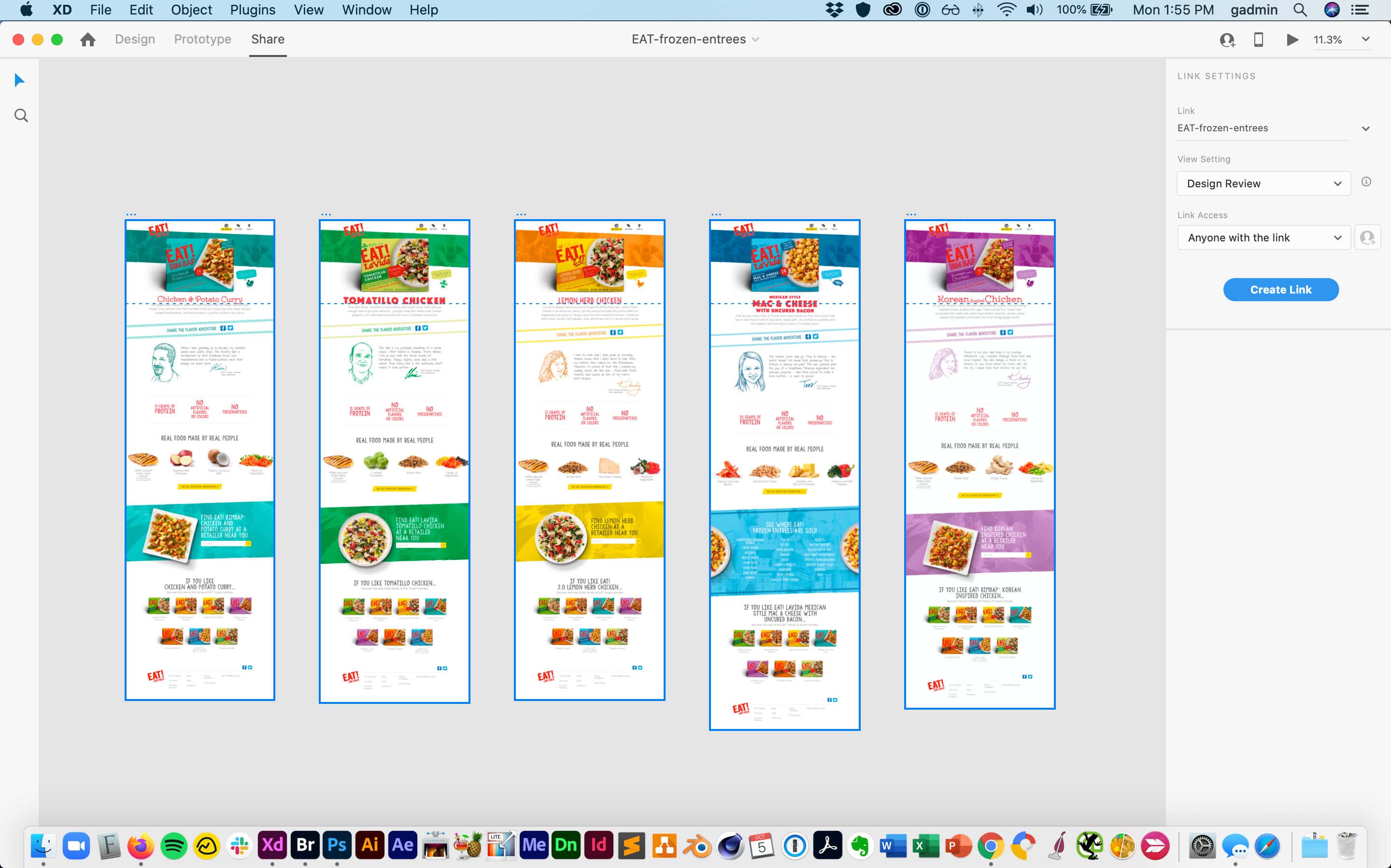
Once the wireframes were approved I designed three desktop and mobile layouts in Adobe XD to establish the overall user interface style. Because the brand had such rich imagery, a big consideration of mine was page speed. During design I realized the headline font they used on packaging and requested for the site was pretty heavy since the distressed style resulted in too many intricate waypoints. I opted for a similar and simpler font which greatly reduced the kilobytes. The packaging included several illustrations which I was able to create vectors SVGs. This file type was smaller and crisper for retina displays.

prototyping

This project was more than a simple brochure website. I designed the map for an interactive, real time product locator map and a multi-step contact form. These interactive modules are best understood through a prototype so I used InVision to sync my compositions and indicate each page's relationship to one another as well as show element (buttons, fields, et cetera) alternate states and micro-interactions. Because the prototype was cloud based I was able to share the live link with our off-site developer and gain his feedback early in the process. The internal team gave me constructive feedback which I implemented before presenting to the client.

dev handoff

Design intent cannot always be related in mockups. Once the designs were approved I collected all my notes and assets that might aid the developer in understanding my vision. Notes included specific technical considerations such as flexbox and fallback options as well as desired file types and animations. In order to visualize the motion design, I created some videos and citied codepen examples. In addition to handing over a library of graphical assets, I also indicated html type treatments, brand colors and margin/padding.

quality assurance

Previous to my involvement, the internal team didn't have a decided web design process. So I established many of the expectations for design rounds, design tools and review on this project and others. After our developer built the site in Wordpress, I went through a two stage QA process. Stage one involved meticulously analyzing and detailing the front-end desktop and mobile page designs within a single browser – looking for visual errors as well as calling out backend optimizations. Once the prominent issues were resolved, I ran a complete browser test to ensure nothing was inherently broken. I used a variety of tools including Skitch, Dropbox and ToDoist to catalogue and resolve bugs.

paid social ads

Once the site was built and launched, Bellisio asked us to manage a paid social media campaign. I began by conceptualizing a dozen different brand messages that reinforced the brand, and which could easily be repurposed from week to week. I created website click ads, carousel ads and video ads within Facebook's Creative Hub so copy and design could be pushed live expediently.

in conclusion

This was a complex project that required both creative and technical execution. Throughout my process I regularly consulted my team and checked in with my project manager to ensure I was both effective and efficient. As a designer, I seek early and frequent feedback to ensure the project is meeting expectations and minimize changes. This ensured the project was completed on time and on budget. Do you need help with your brand, strategy, design or SEO? Send me a message to see how I can help.

see more work

let's talk