matthew sandahl

UI/UX Designer

case study

Wilson Learning

Wilson Learning provides consulting services for leadership and sales development. They asked our team to redesign and architect the site in order to further users along the marketing funnel and ultimately improve sales. Our SEO and Paid Search departments monitored assessed and planned improvements to this end as well.

the old site

The largest issue with the previous website was the usability. The layout was reminiscent of early Web 1.0 days with an aside bar on the right, duplicate left navigation, short pages and triple stacked header navigation. This poor user experience combined with flat copy, "stock-y" photos and dated web practices led to a lack of user trust and decreasing conversions.

A moodboard of design inspiration which I curated during the entire project.

who's it for?

The client had six specific personas in mind but they were really only speaking to two – leadership and sales professionals. I proposed we directly address the larger group directly by creating new content and pages with related content tailored specifically to them. The site was huge so we had a lot of resources, case studies and events to help the user on their journey.

A Resource page. Wilson Learning had a large number of free resources.

my role on the team

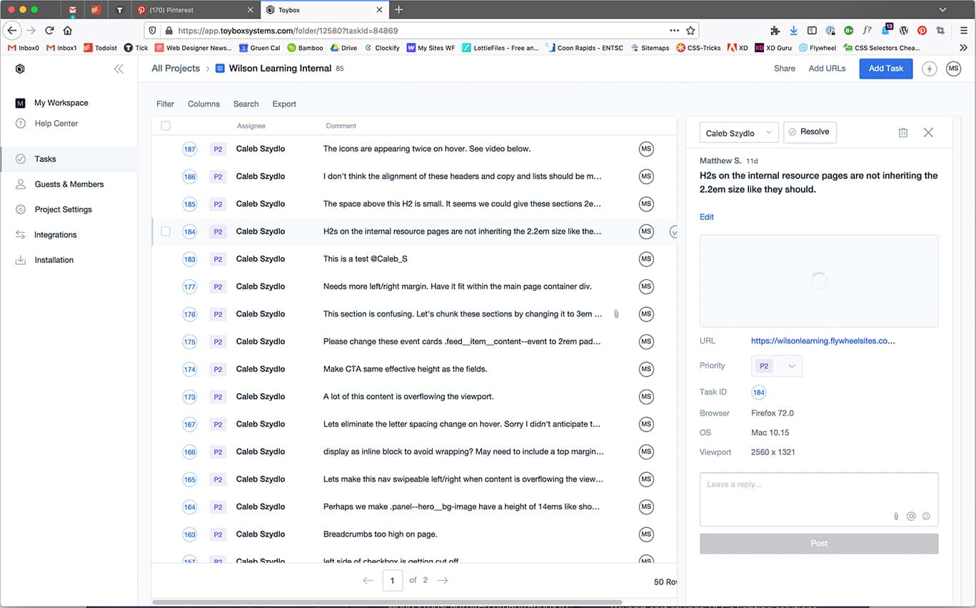
Our team consisted of a project manager, our earned media specialist, two developers, a copywriter, an intern and myself. We coordinated our efforts using various tools such as basecamp and had bi-weekly meeting with the client which I often led during the design phase. I was responsible for the discovery, site architecture, wireframes, mockups, prototypes, animations and lead role during quality assurance.

discovery

I began the process with research to better understand their services and see how they measured up to competitors in their market. To ensure I was delivering on the client's goals I requested they complete a questionnaire which sought to get explicit feedback on their specific hopes and goals for the new site.

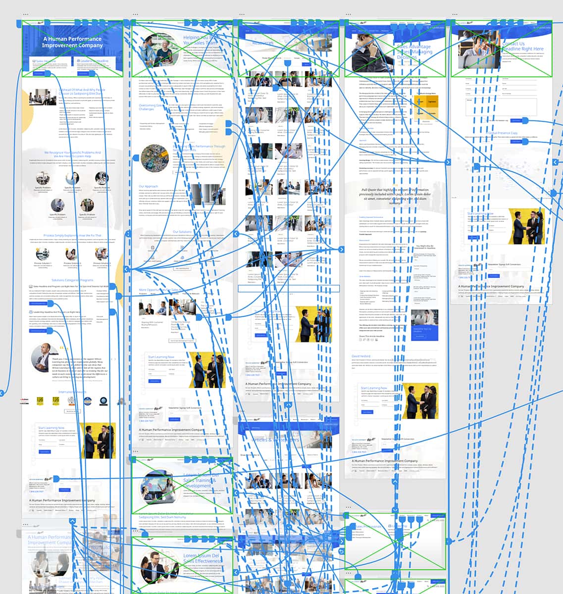
site architecture collaboration

I participated in a card sorting exercise which helped us challenge our own assumptions in regards to webpage architecture and better understand the ideal user flow. I performed an SEO crawl of the site and consolidated the best feedback from our findings.

simplify and reorganize

The site was messy and complicated. I decided to consolidate several parent pages' content in order to lower the click depth and change the focus explicitly to client identified personas; where information could be specifically written to corporate roles, their responsibilities and pinch points. Creating wireframe sketches helped me quickly develop the talking points and story for myself before ultimately creating higher fidelity wireframes.

the process

A gantt chart timeline allowed us to overlap team tasks and shorten the project timeline. Weekly team check-ins kept us unified throughout the process. Proposed designs, iterative designs and feedback could be shared with the client through interactive links which I managed.

brand consistency

I created three mood boards which gave the client a better idea of how their brand might be represented in a digital environment. Once a direction was chosen I built a custom responsive scalable pattern library using webflow which defined specific fonts, colors, UI elements and modules so that I could explicitly call out my intentions to our developers and have source of UI truth that everyone could refer back to.

quick prototypes

Static mockups were not going to give us a clear and early picture of the future site considering the scale of this multi-language and regional site so I created interactive prototypes within Adobe XD for both desktop and mobile. To make the experience more familiar and congruent with a robust web app, I took advantage of a few recently browser supported developments in front end development such as flexbox and sticky positioning.

design with real copy

Content is king which is why I often scraped the existing site for content and automatically placed those images and talking points within my mockups. By identifying buckets of information I was able to export lists of content to a CSV and import to Adobe XD through a plugin. Consequently the cognitive load during reviews was lower because we all knew what we were looking at.

motion design

When time is scarce and budgets depleted, micro-interactions are first on the chopping block. Because of our staggered approach I was able to create working coded animations for most of the new iconography I'd developed. These animations were low stress on users' CPUs because of how I used next gen image formats including SVGs and WebP.

quality assurance

We gave ourselves two weeks to ensure the site appeared and functioned the same way as proposed. I initiated use of a QA feedback tool that more seamlessly married developed pages with internal/client comments and tasks. This new process was more efficient and timely than previously used project management tools. Once the site matched mockups, I thoroughly tested the site in various browsers and communicated issues with our dev team.

how did it end?

The launch was a success. Our ongoing paid search, social and SEO campaigns ensured the site received a lot of traffic to additional landing pages. A/B and user testing ensured the site grew with the data we collected. Do you need help with your brand, strategy, design or SEO? Send me a message to see how I can help.

see more work

let's talk